


Simply put, apply different CSS styles to different screen resolutions. For example, on computers and Pad devices, if the screen is relatively wide, you can place two divs in a row.
When it comes to the phone or when the Pad is held upright, only one Div is placed in a row.
Here are two key points:
One is how to adjust the layout without modifying the Dom structure.
The second is how to determine the screen resolution and apply the corresponding CSS.
Both of the above should be independent of JS.
Achieving the first point relies on streaming layout. That is, all DIVs participating in the layout are expressed as float: left, and the width is expressed as a percentage. For example, in the following figure, the width of the yellow part is 60%, and the width of the orange color is 40%.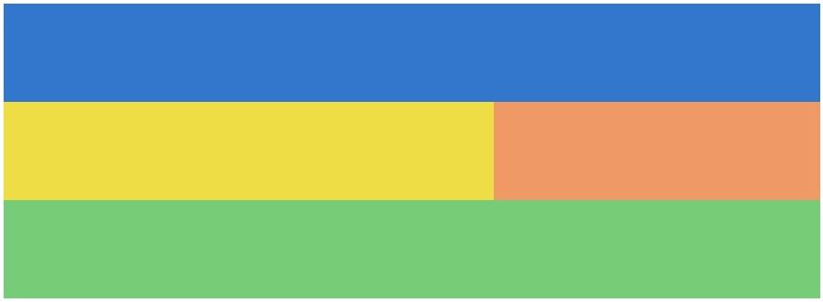
If the width of both yellow and orange colors is 100%, then it changes from 1 line to 2 lines, as shown in the following figure. To achieve layout changes without modifying the Dom.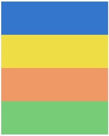
How to dynamically adjust CSS styles without using JS is the second key point.
HTML5 provides a new CSS syntax - @ media, the scientific name is Media Query, which allows you to set different styles for different resolutions.
1 | /* Phone Portrait (320px) */ |
The meaning of the above code is to apply the style in braces when the screen width is less than or equal to 320 pixels. The following figure shows the effect in the browser when CSS takes effect: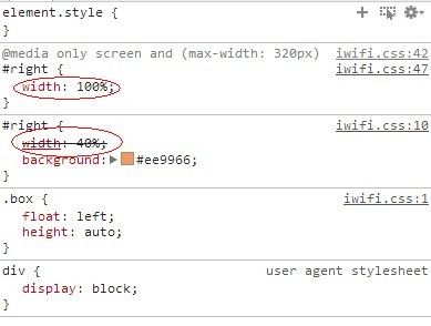
@Media has some more complex uses, such as:
1 | /* Phone Landscape (480px) */ |
This sentence is for the iPhone horizontal screen. That is, it takes effect when the browser width is between 321-480 pixels and the direction is “landscape”.
However, since Retina’s seductive screen was introduced, resolution has not been able to represent the truth of the world. The small Note3 has a higher resolution than some 17 “displays.”.
Therefore, it is also necessary to determine the pixel density of the device - device pixel ratio.
1 | @media only screen and (-moz-min-device-pixel-ratio: 2), only screen and (-o-min-device-pixel-ratio: 2/1), only screen and (-webkit-min-device-pixel-ratio: 2), only screen and (min-device-pixel-ratio: 2) |
For example, the above statement determines the rendered style if the pixel ratio of the terminal is 2. It can be applied to devices such as iPhone 4 and iPhone 5.
In addition to the above two points, it is also necessary to add a meta tag for the viewport to the page, otherwise there may be automatic page zooming on the phone. For example:
1 | <meta name="viewport" content="width=device-width; initial-scale=1.0"> |
To summarize, there are three key points to reactive layout:
Liquid Layout
Media Query
viewport
For specific details, please study the relevant grammar yourself.
The syntax of Media Query is relatively complex. Here is a tool that everyone recommends to facilitate layout design and automatically generate Media Query statements for various devices: